3.18.2009

working with photography and illustrator


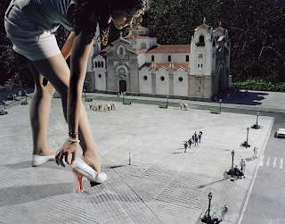
The past two weeks I've been creating a project for my photography class incorporating photography that I shot and illustrations I create in Illustrator. It was a really cool and creative process/experience for me. I decided to create images that allude to nursery rhymes but set them up compositionally and contextually in ways that we aren't use to seeing our childhood favorites. It was a great experience and a way for me to better my skills in Illustrator, though I have much to learn still in the program. Let me know what you think.

Designs this week


This week I was able to design my first real cover. It was really exciting to see the process from beginning to end, as well as getting a little experience in art directing. It was as in depth as I was hoping but as artists/designers/photographers we don't like someone hounding us as we work. Overall I'm really happy with the cover. Check out here and Thursday's issue!

You can't miss Le Raclet print studio


You have to check out Le Raclet. It's the cool urban and modern screen print studio that creates edgy and pop-esque print works on T-shirts and solo prints, not to mention books and softies. It's based out of Milan and surrounds a handful of bright young artists that are really a bunch of friends trying to get their fresh new work out there. Check it out!

You can't miss Mike Perry's typography


On netdiver, they highlighted artist Mike Perry. He has really cool illustrations and drawings, but his work with typography is edgy and fun. They are characters with character. He even wrote a book cleverly titled Hand Job: A Catalog of Type. He's done work for several magazines such as Dwell and Nylon as well as creating logos for Urban Outfitters and T-shirt designs for band Modest Mouse. Check him out!

3.11.2009

Logo designing

This week we had to create 20 different logo designs and execute 10 of them. This was a challenge for me. It's kind of difficult to switch your brain off of magazine design mode and switch to something different. As an artist and a designer, I really had to combine the way I think about photography or drawing with the way I think about content-driven magazine design. Also coming up with something that isn't too generic, but also nothing too elaborate was hard. Some of the designs I finally came up with turned out nicely; I'm happy with them. Using buzz words to spring ideas off of really helped me in my process and trying to weed out the overly cliche ideas was good practice for me. I'll post some of my designs soon so you can check them out.

Design work

Due to flashdrive issues, I'll be posting some design work I have tomorrow when I can get to the server. More to come.

Can't miss Henrik Abrahams


Another netdiver find, you've got to check out Henrik Abrahams' pencil drawings. They're really well designed and interesting concepts executed in a different way. His use of multiple images and typography in his layering makes it really interesting. Check out his other work.

You can't miss Camelia


On netdiver there was an artist featured named Camelia Dobrin. The characters in her illustrations are full-teethed and a bit out of the ordinary. I think they remind me of the old school Nickelodeon show "AAAAH! Real Monsters." Anyone remember that one? Check out her site Camellie.

3.04.2009

Designs as of now...


Currently I'm working on the three cover designs for the caffeine feature. I had some trouble coming up with concepts that are as far from cliché as I could try to get. That's a difficult topic and a very broad one as well. But those designs are still in the works so I'll post them either later tonight or tomorrow. 

In other design news, I'm going to be working on Renovate/Style's feature on a B&B in Columbia. That too will be posted as the designs are worked out. 

I'm not very far on my website, at all, but I've started to come up with ideas for how I might want it to look. Tell me what you think about my logo idea. This is a trademark of sorts. I always sign paintings and other works of art with a logo like this (minus the "designs" of course). I also have a possible home page.

Oh how editing will change your life...


So I am a server at Outback Steakhouse and recently we rolled out with new menus that feature 15 meals under $15. That's the company's new marketing strategy and a way for them to roll with the times during this economic recession. However, with our new menus came new coasters. Every restaurant needs cool advertising ploys on their coasters, but ours drives me banana sandwich. Here's why: It says "Think Australian. Live Adventurous." Adventurous is an adjective not an adverb, which is necessary when describing the verb to live. Jen really did open my eyes to catching grammatical errors in print. I even gave her a coaster to keep. I don't understand their thinking behind this. Either they didn't realize the slip or they were lazy and thought -ly couldn't fit nicely on the square coaster. Whatever the case, it's incorrect. Maybe they should've gone with "Think Australian. Think Adventure." Done and done. They need to hire some MU strat comm majors in order to steer clear of problems like this.

You can't miss Scott Listfield's astronauts


Scott Listfield's paintings are unique with a heavy overtone of humor and an undertone of cultural discourse. In his artist statement he says, "I paint astronauts and, sometimes, dinosaurs. The astronaut in my paintings is simply here to explore the present." He discusses the obsession in the late '60s to Stanley Kubrick's 2001: A Space Odyssey and then later other cultural crazes such as The Jetsons, Lost in Space and Jurassic Park. "Generations raised on these programs, movies, comic books and novels are now grown and living in a future filled with mini vans, Starbucks, iMacs and Hip Hop videos," Listfield says. His work wittingly combines these two ideas of the past obsession with space and today's culture.

You can't miss Julia Fullerton-Batten


On netdiver I found this really cool photographer, Julia Fullerton-Batten. Her two latest works In Between and Teenage Stories are really awesome. In Between she deals with gravity effects and Teenage Stories has a bit more melodrama behind them but the way she incorporates miniatures in the images with the girls is really interesting.